For more than 135 years, Johnson & Johnson’s logo remained unchanged, with the familiar, looping red script adorning its products — from Band-Aids and baby shampoo to medicines and medical devices.
However, that iconic logo is no more. Just a few weeks after J&J spun off its consumer health business into the standalone company Kenvue, the healthcare giant unveiled a new logo and brand identity that it says better aligns with its future.
“Johnson & Johnson’s brand transformation marks a new era for the company, which is now exclusively focused on healthcare innovation and tackling the toughest health challenges,” Vanessa Broadhurst, Johnson & Johnson’s executive vice president, global corporate affairs, told PharmaVoice via email. “As part of this effort, the company is uniting both its MedTech and pharmaceutical segments under the Johnson & Johnson brand name to demonstrate its collective power in healthcare.”
In addition to the new logo, J&J’s pharmaceutical segment, Janssen, has been renamed Johnson & Johnson Innovative Medicine, which Broadhurst said, “better conveys the relationship and our focus on addressing the most complex diseases in the areas of oncology, immunology, neuroscience, cardiovascular, pulmonary hypertension, and retina and to develop the potential medicines of tomorrow.”
Its medical technology segment is still known as Johnson & Johnson MedTech.
What’s behind the image reboot for one of the largest pharma companies in the world?
An industry of reinvention
J&J is hardly alone in giving its brand a refresh.
Many pharma companies have leveraged rebrands, said David Paragamian, CEO of the healthcare communications firm Health Monitor Network and a pharma marketing instructor at St. Joseph's University in Philadelphia. His healthcare career has also included stints at Johnson & Johnson-McNeil Consumer Healthcare and the ad agency Razorfish Health.

“Pharma is the most prolific re-brander versus other verticals,” he said.
Whereas a consumer products company like Procter & Gamble can leverage a brand’s identity for decades — the company’s hallmark detergent Tide was introduced in 1946, for example — pharma is fighting against the “patent clock.” Even the biggest, most successful drugs in the world lose their exclusivity after a handful of years.
“Pharma branding is … high-stakes, high-speed. You’ve only got a certain amount of time,” Paragamian said. “You’re working against the clock.”
This ever-evolving landscape requires constant reinvention.
The ‘why’ behind a rebrand
Patent clocks are just one of the reasons that pharma companies are so familiar with rebranding. Companies frequently rebrand to declare a new future or to distance themselves from the past, especially in an age of rapid-fire M&As, Paragamian said.
In particular, Paragamian pointed to AbbVie, which spun out of Abbott, and Astellas Pharma as good examples of future-looking rebrands that included new company names.
“Abbott minus the diagnostics business is AbbVie because it’s about this future-leaning pipeline,” Paragamian said.
"Pharma is the most prolific re-brander versus other verticals."

David Paragamian
CEO, Health Monitor Network
Similarly, when Yamanouchi and Fujisawa combined to form Astellas, Paragamian noted that the change was “all about the combination of their pipelines and what the new company’s going to be about.”
Other times, though, rebrands attempt to create distance from a problematic past.
“Purdue minus Oxycontin equals Knoa Pharmaceuticals,” Paragamian said. “Valeant minus a lot of legal baggage equals Bausch Health.”
In a statement, Purdue said establishing Knoa was part of a plan “under which Purdue will fade away.”
When it comes to Johnson & Johnson, Paragamian sees both the future and the past at play.
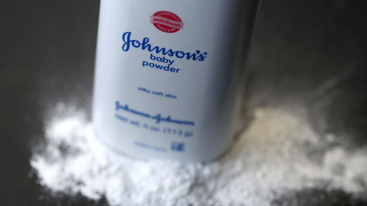
The company has been mired for years in various lawsuits related to claims its baby powder products containing talc cause cancer and is looking to shake off that connection. By spinning off Kenvue and combining smaller, individual brands like Janssen under a unified identity, J&J is “leaning into the high-growth future and consolidating everything in that one, big brand name,” Paragamian said.
In her emailed statement, Broadhurst also pointed to J&J’s forward-looking strategy.
“Our new identity is a powerful way of signaling to our stakeholders that we are evolving and strongly positioned to lead the future of healthcare,” she said. “This new opportunity will help us simplify the way we present ourselves to the world as a company that innovates with purpose to lead where medicine is going.”
Degrees of rebranding
Not every pharma rebrand consists of a full-court name change.
“When people talk about a rebrand, sometimes they’re talking about a graphic design change, sometimes they’re talking about a total name change,” Paragamian said. “But the graphic design change is still done for some of the same reasons; [to] convey the bright, shiny future.”
He said Sanofi’s new logo, which the company unveiled in early 2022, is a great example of this approach. Instead of the more traditional, pastel-colored logo, the new Sanofi logo is cleaner and styled in lowercase black with two purple dots at the beginning and end to represent the journey of pharmaceutical inquiry — from idea to patient impact. It’s also meant to communicate a united company among its many acquired brands.
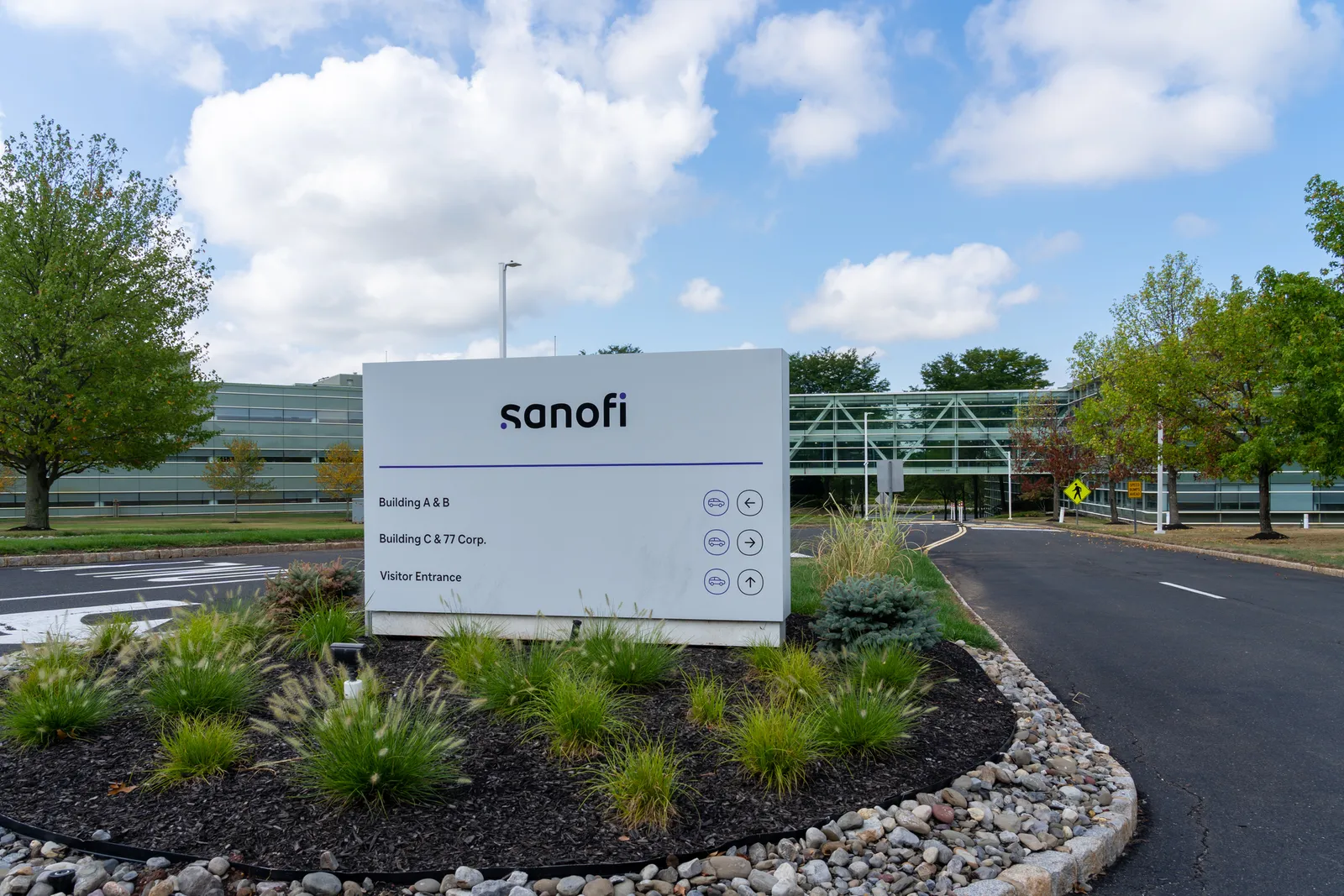
“The name didn’t change, but the graphic design did, and the graphic design is intended to convey some very strategic things about the future and the modernity of the company in a very positive way,” Paragamian said.
No matter the kind of rebrand, they’re all carefully considered and deeply researched. J&J selected the name “Innovative Medicine” for its pharma segment after conducting global market research with healthcare professionals and patients, Broadhurst said.
“We conducted extensive quantitative and qualitative research around the world to understand brand perceptions and expectations,” she said. “We applied insights from several markets to build an identity that fits what the world expects from one of the largest healthcare companies.”
J&J’s new logo also communicates ideas about the company and its values, The modernized script and refreshed shade of red is aimed at conveying a fresh, modern outlook. Even the newly styled ampersand tried to capture “a caring, human nature,” the company said.
However, rebranding doesn’t rely simply on fonts to convey those messages. Broadhurst said their “brand transformation journey” will span the course of many years and include a broad and multifaceted communications strategy.
“This includes utilizing a variety of channels for effective stakeholder engagement such as media, digital platforms, and our own social media networks,” she said. “Additionally, we have introduced our new brand identity at select healthcare professional meetings and conferences.”
Most important is how rebranded companies execute their visions, especially since pharma has “an extremely well-educated audience of healthcare professionals,” said Paragamian.
“You can’t fake it. It isn’t about colors and logos and fonts,” he said. “It's about really delivering on the promise.”
That’s why he believes the innovative medicine-focused rebrand will work.
“That will resonate with healthcare professionals that know Johnson & Johnson to be a high-quality, innovative, scientifically driven company,” he said.


