 We live in an age of “data abundance" — although some might say “overload," especially if you’ve just been confronted with a mass of information you know you need (probably even asked for), but now don’t know what to do with. You may have said you wanted information, but what you really needed was insight.
That’s the gap that anyone working with data and presenting it in today’s information age needs to always be conscious of bridging. The amount of information available to you, to substantiate just about any point you might want to make, is potentially limitless. But your audience’s time and attention aren’t.
Bridging the Gap Using Data Visualization
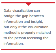
Data visualization is an effective means for bridging the gap between information and insight, but only if the particular visualization method chosen is properly matched to the person receiving the information, their time and attention span, and how they want to use the information presented.
Three key factors are important to keep in mind when choosing an appropriate data visualization approach for a particular person or group.
1. Information Scale.
It’s important to always present information according to the amount of time the recipient has to spend with it, and in a format that matches their data literacy (i.e., the recipient’s ability to process and retain meaning). For example, someone who has limited time will benefit from pre-attentive processing techniques – e.g., visuals that use an elements’ size, shape, color and/or proximity to focus the recipient’s attention and emphasize key elements. For a person with more time, visuals can be structured to bring the hero metric into focus, supported with additional context such as month-over-month shifts, broad trends and comparisons, insights and predictions.
Someone with even more time for data exploration might benefit from custom application solutions (such as those built using D3 JavaScript libraries) enabling them to manipulate the data and understand it at a deeper level.
2. Presentation Context.
Information comes at us all the time, in hundreds of different ways, every day. Our ability to absorb that information and make something of it depends to a very great extent on the circumstances in which we receive it. So when considering the best data visualization method, it’s vital to consider the context:
• If the recipient will only get a chance to glance at the information before heading into a meeting, focus on delivering information in simple, straight-forward visualizations. Did a key metric move? Focus on numerical values and percent changes. Use pre-attentive design to push key elements and allow non-crucial information to recede.
• If there will be an opportunity to explore the information in depth and ladder it up to key insights, focus on information that provides context. With time, users are seeking meaning, so ensure that visualizations provide comparisons with previous data and benchmarks, and clearly source the data utilized. Identify ‘key frames’ in data discovery and bring those to the surface.
• If the person already has deep understanding of the subject matter, they may benefit from a self-directed visualization format enabling them to explore the data with few pre-defined sets of views. Focus on designing how those same “key frames" align to the discovery process and design the user journey around their specific needs.
Dashboards combine data visualizations to create a single point of access to different kinds of data, and they are particularly useful when teams need and are able to act in near-real-time on the information provided. Operational dashboards are helpful in this context because they can impart information quickly. Analytical dashboards, on the other hand, can provide users with at-a-glance information for analysis and longer-range decision-making.
3. Storytelling Model.
Selecting the right type of storytelling model to showcase your data is perhaps the most often overlooked aspect of data visualization, and the biggest opportunity data analysts and presenters have for driving deeper understanding. People naturally attempt to construct narratives of meaning from even the simplest of data visualizations. They’ll find this easy or hard depending on the storytelling model selected, which in turn should be matched to the data exploration style of the recipient.
Linear storytelling — stories the way we were taught them, with a beginning, middle  and end — remains the most recognizable model. It takes the audience through a structured flow with an introduction, exposition, a narrative hook and conclusion — and it’s up to us to decide how to tell that story for maximum impact and understanding. If we’ve selected the right data, and lined it up in the right way, we’re likely to succeed in imparting the meaning we’ve intended — that is, if that’s what the recipient wants and is looking for.
Data visualizations can also be constructed to provide a more self-directed, exploratory storytelling — or story-making — experience. The framework becomes more matrixed, enabling the user to follow multiple paths through the data. For example, Tableau’s Story Presentation provides for a linear set of slides, enabling digital dashboards to allow exploration underneath aggregate data views.
The Importance of the Human Factor
Data visualization is not new. Hundreds of years ago the Incans used a tool called the quipu to store data about numbers through a color and knotting system to record stories about history that could be analyzed without traditional language. The danger today is that it is easy to get caught up in all the data analytics capabilities at our disposal while neglecting the story to be told and not keeping the audience in mind. At its core successful data visualization is, first and foremost, a method of interpersonal communication with human beings at the center, not just a technology. (PV)
Editor’s Note: Pondering the best way to present your data at your next meeting or if you’re a lover of all things data check out my white paper, “Data Visualization and the Human Factor," visit: https://syneoshealthcommunications.com/DataViz.
Syneos Health is the only fully integrated biopharmaceutical solutions organization. Our company, including a Contract Research Organization (CRO) and Contract Commercial Organization (CCO), is purpose-built to accelerate customer performance to address modern market realities.
For more information, visit SyneosHealth.com or email Joe DeSalvo at [email protected].


